This article is for Tempo for Cloud and Data Center
Step 1 - Generate a report in Tempo
Step 2 – Create a Customized PivotTable
Create a PivotTable by clicking the PivotTable button in the Insert tab.

Note: The examples below apply to Excel 2010. If you are using older versions of Excel, please take a look at this page.
Select your table or range in the Create PivotTable dialog, and then click the OK button.

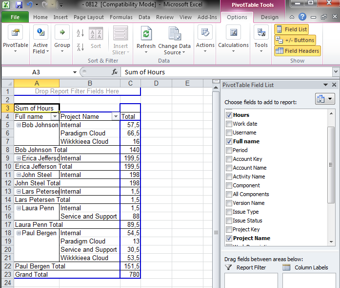
Select the fields you want from the PivotTable Field List.
Working with PivotTables is beyond the scope of this tutorial. However, you may want to refer to this tutorial (and related tutorials) from Microsoft for further information.
Step 3 – Create Custom Reports and Views
Now you can build your views, generate charts or graphs, and analyze your data. In the example below, three fields were selected from the PivotTable Field List: Hours, User Name, and Project Category.

In the screenshot above, the Paradigm Cloud and Wikkkieea Cloud projects have been selected, and the users Bob and Paul have logged some time within the selected period.
Conclusion
Excel can provide excellent views of JIRA and Tempo data. And, all Tempo users can generate a report, export it to Excel, and display the data as they wish. Feel free to leave further questions and feedback below!