Use the Calculate options to change the format of Jira data in your charts.
Calculate Options
|
Count |
Displays the number of Issues or Projects found |
|---|---|
|
Sum |
Aggregates all the values found Example: 10 Story Points + 20 Story Points = 30 Story Points |
|
Average |
Takes the Sum and Divides by Issue Count Example: 30 Story Points ÷ 2 issues = 15 Average Story Points per Issue |
Any Number or Date field will be selectable on the field list
The calculated value is shown as a column in the legend table, the y-axis label on bar charts, and the calculated %
Scripted and calculated fields from Jira add-ons (e.g. ScriptRunner or JMCF) can also be used as a Count value, as long as they are number fields.
For calculations involving time logs, the default time unit is hours and can be changed to days, weeks, months, or years
Calculations can also be made that compare multiple date fields
Under common fields, you'll find the following options for date comparisons
|
Time Since |
Calculate the time since a specific date based on the selected date field |
|---|---|
|
Time Until |
Calculate the time until a specific date based on the selected date field |
|
Time Between |
Calculate the time between two date fields |
|
Time to Resolution |
Calculate the time between creation and resolution. This calculation uses the Resolved date (the date a resolution is set on the issue). Check 'Include unresolved issues' – if you choose to include these issues, their time to resolution will be between creation and the current time. |
Additional Calculations Options
|
Cumulative total |
If toggled on, the cumulative total will be displayed (each segments' total includes the sum of all preceding segments up to that point). |
|
Calculation totals only count unique issues |
If toggled on, if an issue is present in more than one segment, totals will only include it once. This may result in totals being less than the sum of the segment. |
Custom Calculations
In Custom Charts, users can measure any number field with a custom calculation or custom progress.
|
Custom Calculation |
In the 3 dropdowns, select a Jira number field, choose to add, subtract, divide, or multiply, then select the 2nd Jira number field you want to measure (options are below). |
|
Custom Progress |
In the 1st dropdown, select a Jira number field, then in the 2nd dropdown, select another Jira number field to see the progress of the 2nd field out of the 1st field |
Additional Calculations
For certain Custom Charts chart types, users can add additional calculations after the primary Calculation is selected (the two Calculate dropdowns at the top of the gadget or macro are set).
The additional calculations can be found in: the Legend tab for pie charts and funnel charts; the Calculations (+) tab for 1D bar charts; or the Columns tab for 1D table charts.
To add an additional calculation:
-
Click the Legend, Calculations, or Columns tab (depends on chart type)
-
Scroll down to the Legend Columns section, and click +Add column
-
In the 3 dropdowns, choose how you’d like to measure the field (COUNT, SUM, or AVERAGE), choose the number or date field you’d like to measure and display, then choose to hide or show the percentage field (eyeball icon)
-
Repeat steps 2 and 3 if you’d like to add even more calculations
Chart Types With Additional Calculations Allowed
|
Pie Chart |
Bar Chart |
2D Grouped Bar Chart |
2D Stacked Bar Chart |
Line Chart |
|
|
|
⛔ |
⛔ |
⛔ |
|
2D Line Chart |
Funnel Chart |
Table Chart |
2D Table Chart |
Tile Chart |
|
⛔ |
|
|
⛔ |
⛔ |
Multiple Calculations on 1D Bar Charts
If you add additional calculations on the Calculations (+) tab in 1D Bar Charts, each additional calculation is displayed as a new bar on the chart (see below).
.png?cb=3b364f65ea0bb6edc04c3055e42593e1)
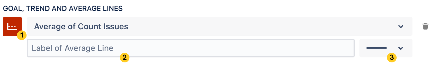
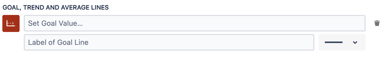
Goal, Trend, or Average Line
Only available on axis charts (line charts and bar charts).
You can add additional insight into the data of line charts and bar charts with trend, goal, or average lines.
Purpose of Each Line
|
Add average line |
This line displays the mean or average value of the data points. |
|---|---|
|
Add goal line |
This line represents a set target or objective. |
|
Add trend line |
This line displays the general direction or tendency of the data over time. |
Customization Options
|
All lines (average, goal, and trend) |
Goal lines only |
|---|---|
|
|