Tailor your charts with minimum and maximum values to highlight specific data ranges. Setting these values may improve your chart by:
-
Improving readability: Reduce visual clutter to better identify key trends and patterns.
-
Enhancing focus: Show only the most relevant data to avoid distractions.
-
Customizing insights: Provide specific analytical needs. For example, identifying outliers or comparing performance metrics.
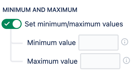
Turn on Set minimum/maximum values on the Chart By tab, then enter a value in one, or both, fields.
Additional customization
Go to the Display Options tab to view additional options to customize a chart that has minimum and maximum values set.
The available options differ based on your chart’s type:
-
Pie and Funnel charts: Select a Hide excluded segments from option to hide out-of-range segments from the chart, or from the chart and the legend.
-
Table and Tile charts: Toggle Show placeholder for excluded values to add placeholders for out-of-range segments.
-
Use the Show placeholder for excluded values setting to choose if you want segments outside of the minimum/maximum range to be displayed on the chart with placeholders
-
Use the Display maximum line at the highest segment setting to shorten the y-axis to the highest segment’s value, regardless of the set maximum value