This article provides an overview of how to add, configure, and manage Custom Charts.
If you need inspiration, or want to see what’s possible with Custom Charts, go to our Custom Charts Showcase or Use Case Library.
Adding a new chart
To add this gadget to a Jira dashboard:
-
Open the dashboard and select Edit.
-
Select Add gadget.
-
Scroll to the gadget and select Add.
You can also enter the name of the gadget in the search field to find it.
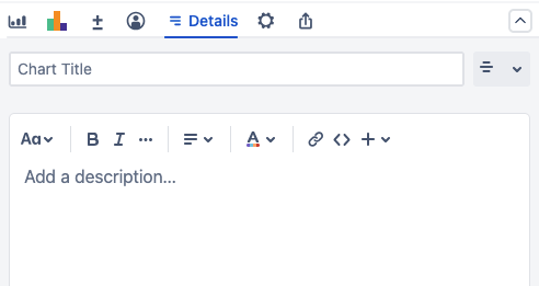
After you add a gadget, go to the Details tab to give it a Title and an optional Description.
Configuring a chart
Data source
Select a source to pull data from to use in your charts.
-
Projects: Pulls data from one or more selected Jira spaces.
-
Saved filters: Uses the selected custom filter to pull data.
-
Custom JQL: Pulls data using the provided JQL query.
The following options are also available depending on your configuration:
-
Simple Search Gadget: If you add a Simple Search to your dashboard, select this option to use that search. If a Simple Search exists before you add a chart, it will be selected by default.
-
Structure: If Structure is installed on your Jira instance, you can select one or more structures to use as the data source.
Chart type
Choose how the data is visually represented on the Dashboard or page. You can change the chart type at any time.
Go to our Chart Types article for more details on each type and to view examples.
|
Chart Style |
Description |
|---|---|
|
Standard charts |
|
|
Pie Chart 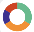
|
Represents your data as slices based on the Chart By segments.
|
|
Bar Chart 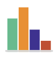
|
Represents your data as vertical bars, with each bar corresponding to a Chart By segment.
|
|
Line Chart 
|
Represents your data as a line connecting individual points of data based on Chart By segments.
|
|
Funnel Chart 
|
Represents your data with stacked horizontal bars, sorted from largest to smallest. Each bar corresponds to a Chart By segment.
|
|
Table Chart 
|
Represents your data in a table, with each column representing a Chart By value. Calculations are displayed in a separate column if your chart has any.
|
|
Tile Chart 
|
Represents your data in individual tiles, with each tile corresponding to a Chart By segment.
|
|
Two-dimensional charts |
|
|
Grouped Bar Chart 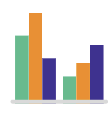
|
Represents your data as vertical bars. Each bar corresponds to Chart By segments, and those bars are grouped according to the Group By segments.
|
|
Stacked Bar Chart 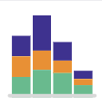
|
Represents your data as vertical bars with horizontal slices of data. Each bar corresponds to Chart By segments, and each slice corresponds to Group By segments.
|
|
Line Chart 
|
Represents your data as multiple lines that connect individual points of data based on Chart By segments. Each line corresponds to a Group By segment.
|
|
Table Chart 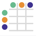
|
Represents your data in a table, with each row representing a Chart By segment and each column representing a Group By segment.
|
Segment data sources
Select Chart by to pick a data source for your chart’s segments.
You can select from any field available in your Jira instance. This includes custom fields, system fields, and fields provided through app integrations.
The following advanced fields are also available:
-
Custom JQL: Each segment of the chart uses a custom JQL query.
-
Saved filters: Each segment of the chart uses a custom Jira filter.
-
Dates: Each segment of the chart represents a date. The amount of segments is determined by the Range and Grouping options.
Data grouping sources
If your chart is two-dimensional, you must select a Group by source to organize your chart’s segments.
You can select from any field available in your Jira instance. This includes custom fields, system fields, and fields provided through app integrations.
The following advanced fields are also available:
-
Custom JQL: Uses a custom JQL query to determine the chart’s groups.
-
Saved filters: Uses a custom Jira filter to determine the chart’s groups.
-
Dates: Each segment of the chart represents a date. The amount of segments is determined by the Range and Grouping options.