The following chart types are available when you create a custom chart.
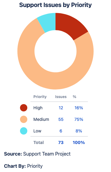
Pie Chart
What is a pie chart?
A pie chart displays your Jira data as a pie, with each slice representing the Chart By option selected. When to use this chart type
Examples
|
|
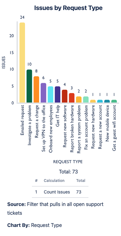
1D Bar Chart
What is a bar chart?
A bar chart displays your Source data as a set of vertical bars along the x-axis, with each bar representing your Chart By dropdown selection. When to use this chart type
Examples
|
|
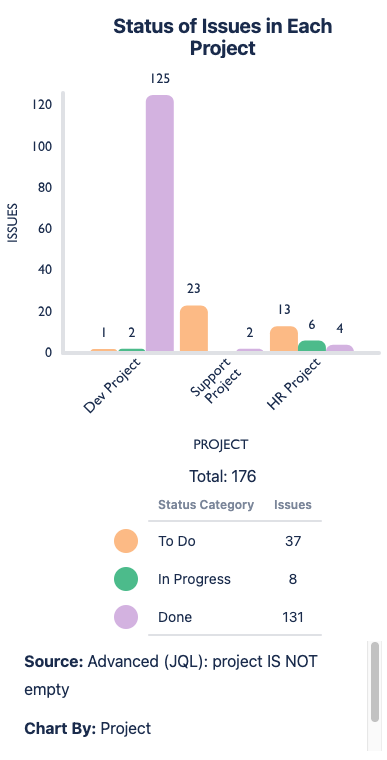
2D Grouped Bar Chart
What is a 2D grouped bar chart?
A 2D grouped bar chart displays your Source data as grouped sets of vertical bars. Your Chart By option represents the values for each vertical bar, and your Group By option groups the bars. When to use this chart type
Examples
|
|
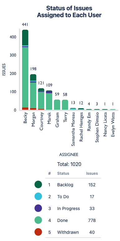
2D Stacked Bar Chart
What is a stacked bar chart?
A 2D stacked bar chart displays your Source data as a set of vertical bars along the x-axis with each bar sliced into colored segments horizontally. The Chart By option sets the vertical bars, and the Group By selection sets the horizontal segments. When to use this chart type
|
|
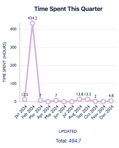
1D Line Chart
What is a line chart?
Points connected by line segments to demonstrate changes in value When to use this chart type
Examples
|
|
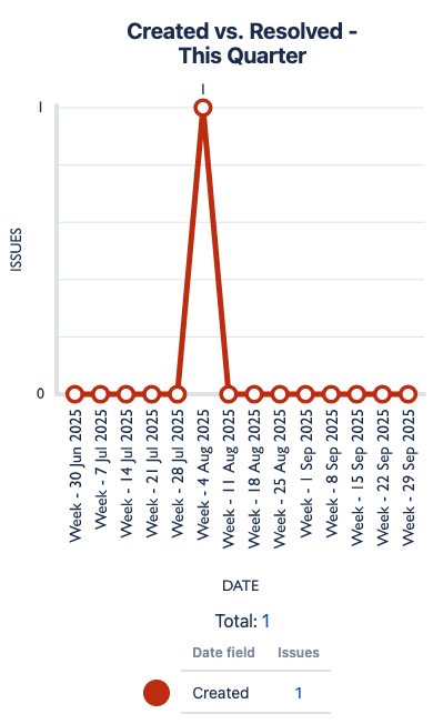
2D Line Chart
What is a 2D line chart?
Points connected by line segments to demonstrate changes in value When to use this chart type
Examples
|
|
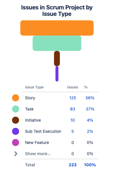
Funnel Chart
What is a funnel chart?
Displays your Chart By data as horizontal bars in the shape of a funnel (biggest value to smallest value) When to use this chart type
|
|
1D Table Chart
What is a table chart?
Displays your Chart By data as a column in a table, with your Calculate option(s) as additional column(s) When to use this chart type
Examples
|
|
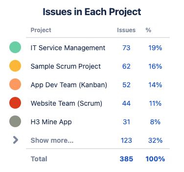
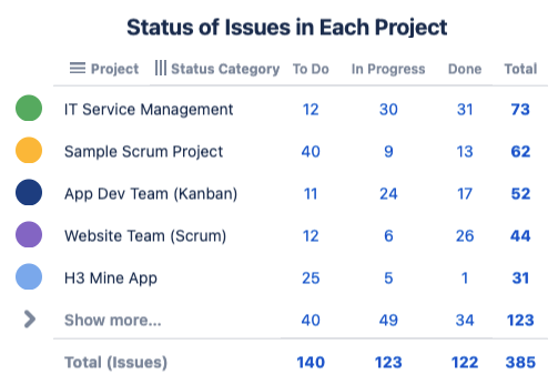
2D Table Chart
What is a 2D table chart?
Displays your Chart By data as a single column in a table, and your Group By as the additional columns When to use this chart type
Examples
|
|
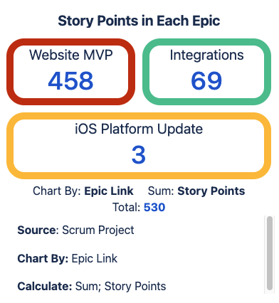
Tile Chart
What is a tile chart?
Displays your Chart By data as rectangular tiles. When to use this chart type
Examples
|
|