Use calculation options to change how Jira data is measured in your chart. Calculated values are used as the y-axis on charts and are included in the chart’s legend.
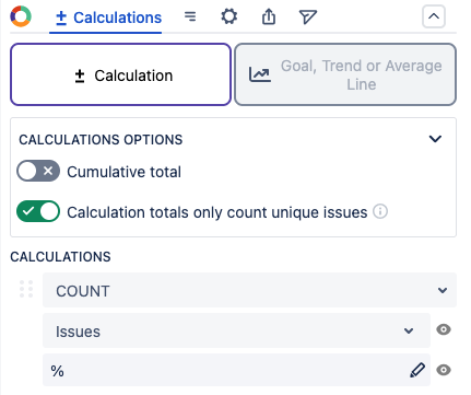
The following options are available for how to display calculated values:
|
Option |
Description |
|---|---|
|
Cumulative total |
When enabled, the calculated values will display as an ongoing sum where each segment also includes the total from the previous segment. |
|
Calculation totals only count unique issues |
When enabled, calculations will only use one version of each work item, even if it appears in multiple data sources or segments. |
Calculations
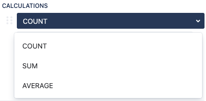
The following types of calculations are available:
|
Option |
Description |
|---|---|
|
Count |
Displays the actual number of items found. |
|
Sum |
Displays the total sum of all values in your data. For example, if your data pulls in five work items with five story points each, this will display a total of 25 story points. |
|
Average |
Displays the total sum of all values divided by the count of work items. For example, if your data has a sum of 40 story points and four work items, this will display an average of ten story points per issue. |
Only numerical Jira fields can be selected as values for calculations. You can also use numerical scripted and calculated fields from Jira add-ons (for example, ScriptRunner or JMCF).
Custom Calculations
You can create your own custom calculations or progress in addition to selecting from existing fields.
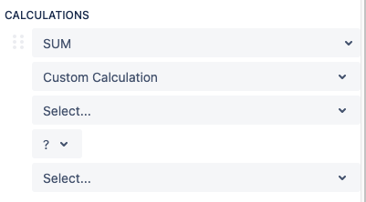
For a custom calculation:
-
Select your first numerical field.
-
Select an operator for the calculation.
-
Select the second numerical field.
For custom progress:
-
Select the main numerical field first.
-
Select a second numerical field to view the progress of that field compared to the first.
Additional Calculations
Click to expand...
Pie charts, bar charts, funnel charts, and table charts have additional calculation options.
The additional calculations can be found in: the Legend tab for pie charts and funnel charts; the Calculations (+) tab for 1D bar charts; or the Columns tab for 1D table charts.
To add an additional calculation:
-
Click the Legend, Calculations, or Columns tab (depends on chart type)
-
Scroll down to the Legend Columns section, and click +Add column
-
In the 3 dropdowns, choose how you’d like to measure the field (COUNT, SUM, or AVERAGE), choose the number or date field you’d like to measure and display, then choose to hide or show the percentage field (eyeball icon)
-
Repeat steps 2 and 3 if you’d like to add even more calculations
Chart Types With Additional Calculations Allowed
|
Pie Chart |
Bar Chart |
2D Grouped Bar Chart |
2D Stacked Bar Chart |
Line Chart |
|
|
|
⛔ |
⛔ |
⛔ |
|
2D Line Chart |
Funnel Chart |
Table Chart |
2D Table Chart |
Tile Chart |
|
⛔ |
|
|
⛔ |
⛔ |
Multiple Calculations on 1D Bar Charts
If you add additional calculations on the Calculations (+) tab in 1D Bar Charts, each additional calculation is displayed as a new bar on the chart (see below).
.png?cb=3b364f65ea0bb6edc04c3055e42593e1)
Goal, trend, and average lines
You can add goal, trend, or average lines to bar and line charts to provide additional insights into the data you’re reporting.
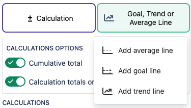
To add a line:
-
Go to the Calculations tab.
-
Select Goal, Trend or Average Line.
-
Select the type of line to add from the list.
-
Average line displays the mean (average) value of the chart’s data.
-
Goal line displays a visual representation of a target date or objective.
-
Trend line displays the movement tendency of the chart’s data over time.
-
After adding a line, you can change the color, label, and style of the line. If you add a goal line, you need to set a numeric value for the goal before it displays.