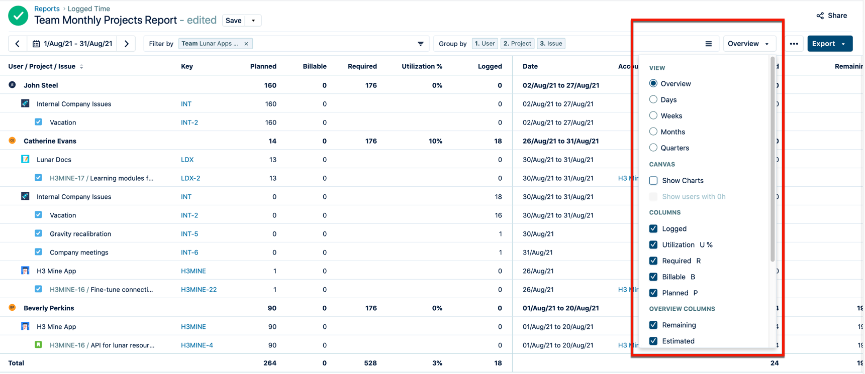
In addition to filtering, grouping, and sorting, you can customize Tempo reports with specific views, charts, and columns in order to show your data in a meaningful manner. This includes an overview format that provides a high-level look at the data, as well as more nuanced views that organize your data by days, weeks, months, or quarters and present it in greater detail.
To further customize your reports, you can add charts to your reports to help understand the report's contents at a glance, as well as add columns to show a variety of Jira fields and work attributes. Finally, you can adjust the way that dates and times are displayed to suit your preferences.
Tempo remembers all your view settings and preferences between sessions.
You can only view data that you have the correct permissions to access. If you see Anonymous user, check your space-level permissions for View Work Item Hours.
-
Select Reports in the Tempo sidebar to create or open a saved report.
-
In a report, open the menu on the right to see the different viewing options and data columns that you can add.
-
Viewing worklogs for your team members in Tempo Reports requires the View Worklogs and Browse Projects permissions. To see worklogs for other users in a space, you need to have the View All Worklogs permission.
-
To report on the planned time, you need to have Tempo Capacity Planner installed. Viewing plans requires the View Plans permission.
-
You can view the worklog data from inactive or deleted Jira users in a report - see Inactive or Deleted Jira Users and Tempo Timesheets for more information.