If you'd like to add visuals to your Logged Time or Planned Time reports -- and get a quick, graphic snapshot of the report's contents -- you can do so by clicking the Show Charts button. (Planned vs. Actual reports display the graphics by default.)
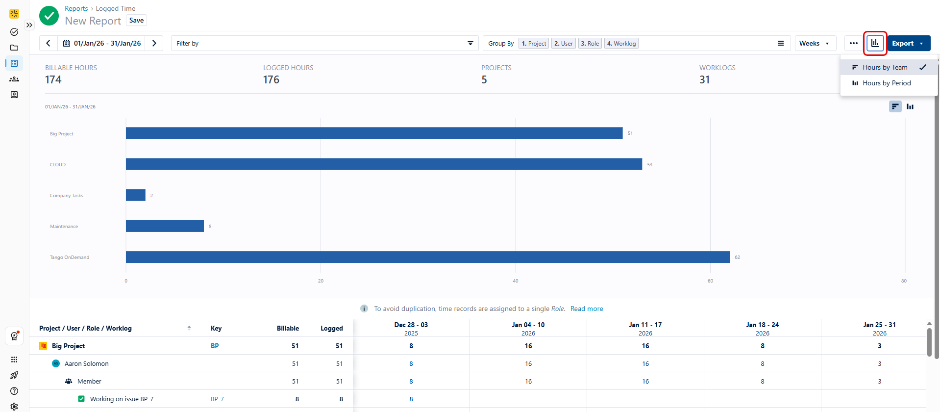
The charts use either horizontal or vertical bars to give you a graphical overview of each report's contents. You can easily toggle between the two graphic layouts by selecting the desired option.
To give you quick, easy insights into the reports, the charts include summary statistics in their headers. In the Logged Time report, this includes logged hours, users, and worklogs. In the Planned Time report, this includes planned hours, planned capacity (or utilization), users, and plans.
To close the bar chart, simply click the Show Charts button again and re-select the currently displayed chart.