Table View
The Table View is a central location for all of your roadmap's items and milestones. It's built to resemble a spreadsheet but is tailor-made to help you quickly locate, input, and manage the key details of your roadmap in seconds.
Everything you create or update in the Table View is automatically shown in your roadmap views, in any of your team's Portfolio Roadmaps using the data from your roadmap, or back to any integrated tools when two-way synchronization is enabled. This helps to ensure that your team stays aligned, informed, and on-track as they're working towards your strategic goals.
All Data Table View vs. View-Specific Table Views
In Strategic Roadmaps, every roadmap has two types of Table Views that a user can interact with - the All Data Table View and a number of View-Specific Table Views. The main difference between the two is that All Data presents the user with the complete list of items on a roadmap, while the View-Specific Table Views will be tied to a roadmap view/visualization and can be filtered down to show a focused portion of the total data set.
Creating Items in the Table View
Users have a number of options for creating items in their roadmaps, including importing their data from CSV and integrating their data from a secondary source. In the table itself, users can quickly create items from one of three locations:
Clicking the + Item Button: Clicking this button in the roadmapping toolbar will automatically trigger the Add New Item Bar at the bottom of the screen, allowing you to type your new item's name and press Enter to save the item in your roadmap.
Clicking into the Add New Item Bar: Similar to the above, users can click into this bar and immediately start typing their item's name. Users can press enter to save the item in their roadmap.
Through the Context Menu: Users can select the Create New Item Below option in their context menu to create a new item inline. This will generate a smaller version of the Add New Item Bar underneath the existing item.
Users can also use similar methods to create sub-items and showcase the parent/child relationship between any items on their roadmap. To create a new sub-item in the roadmap, users can either:
Drag and Drop: Users can drag and drop up to 25 items onto any item that's not currently a child item and convert those items into sub-items.
Through the Context Menu: Users can select the Add Sub-Item option in their context menu to create a new sub-item inline. This will generate a smaller version of the Add New Item Bar underneath the existing item, but with sub-item specific language.
Managing Items in the Table View
When hovering over an item, a small grip appears on the far left side of the row which a user can click and drag to reorder their roadmap items. When a single item is being reordered, the user will see a floating box with the item's name as they drag the item to its new location.
Strategic Roadmaps also allows users to quickly select and interact with multiple items. In order to select multiple items in the roadmap, users can either:
Manually select the items by clicking into the checkboxes which appear on hover
Select a group of sequential items by clicking into the checkbox which appears on hover for the first item, then holding the Shift key and clicking into the checkbox which appears for the last item
Select the entire view by using the Select All checkbox in the top-left corner (beside the Item Name header)
Click and drag the mouse vertically over the items in the roadmap to select those items
When multiple items are selected, a user can choose any of the grips available to drag and reorder those items. When multiple items are being reordered, the user will see a floating box with the count of items being dragged in it. Additionally, when multiple items are selected users can take advantage of the bulk editing feature - allowing them to quickly apply a specific field value to multiple items by applying that field value to a single item within the selected range in the Table View.
Managing Field Headers in the Table View
When working in the Table View, users can quickly reorder and hide the headers in their roadmap to ensure that the data visible in the Table View is going to be relevant to their team. To reorder field headers, users can simply click on the header and drag it to the desired location.
Users can also quickly hide headers by clicking into the menu in any roadmap header and selecting the Manage Columns option. From this menu, users can view all active & inactie headers in their roadmap and hide/reveal headers using the provided toggles.
Table Features & Components
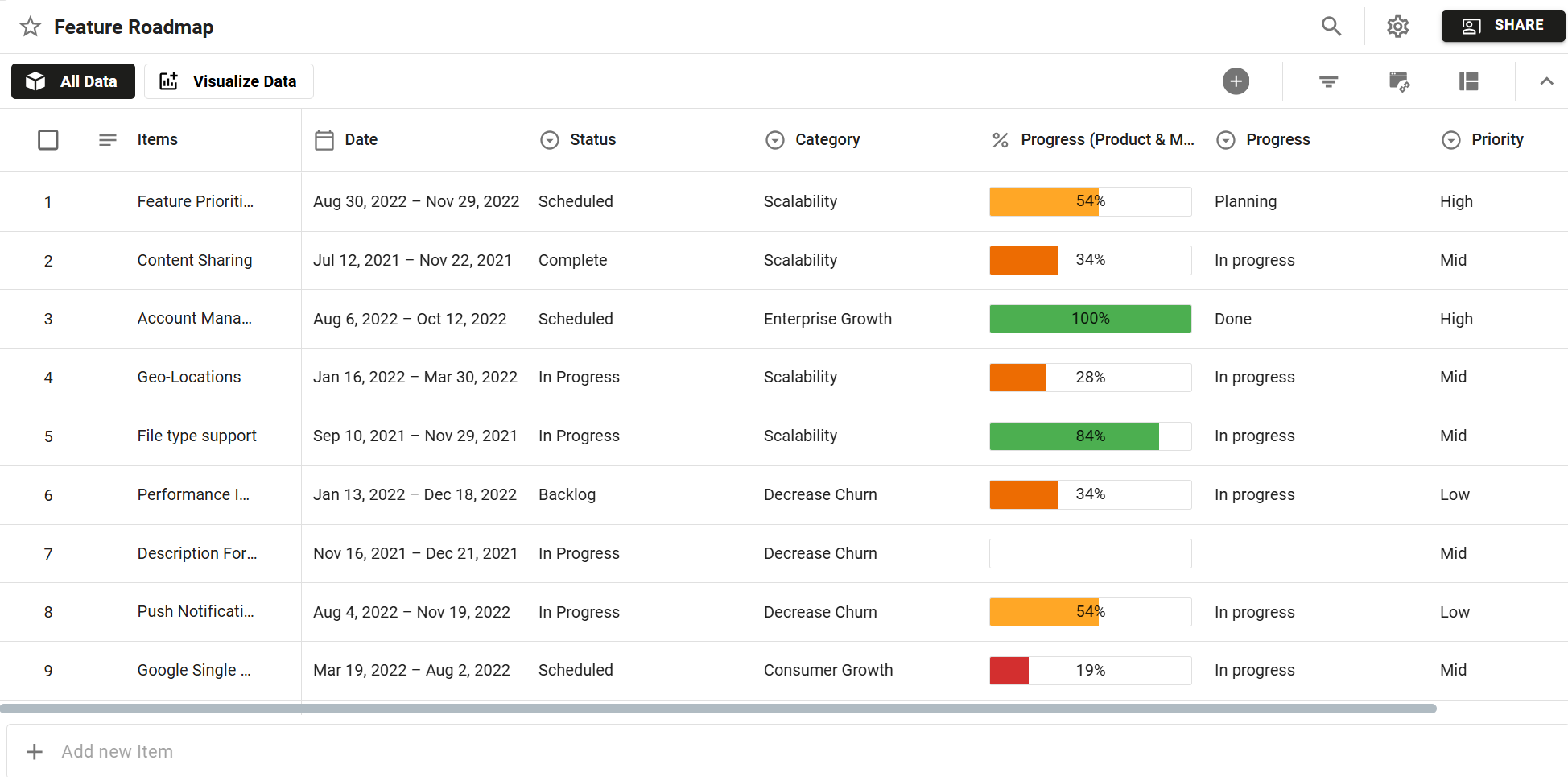
Items Table
Items
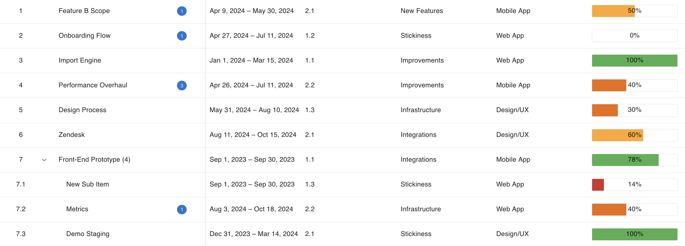
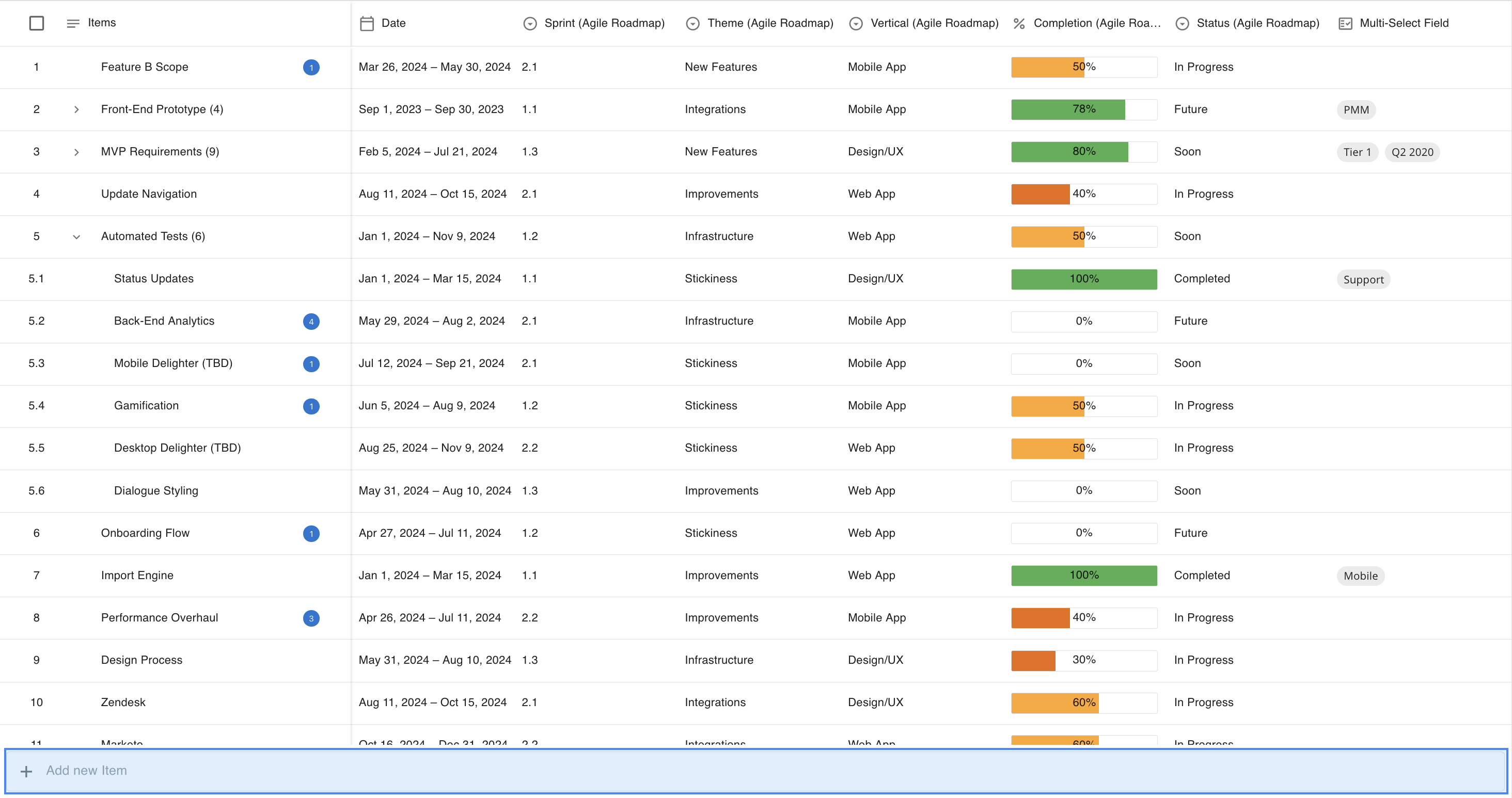
All items in your roadmap are displayed as single rows in the Table View, with each Item's row broken down into columns that correspond with the fields along the top of your Table View. These items are the building bricks of your roadmap and any new items or updates to existing items are immediately shown on your roadmap views.
Item Rank
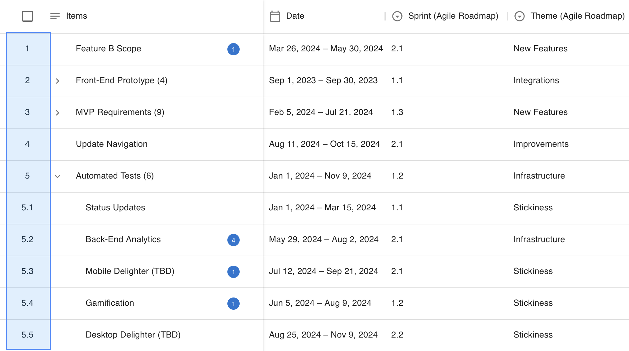
Items in the Table View are ranked numerically and will retain their numeric ranking if/when the table is sorted. This ranking does not interfere with the user's ability to edit the table and the fixed ranking for items allows teams to both pinpoint an item's priority within a view and simplify their understanding of how items will be presented in their roadmap views.
Add New Item Bar
For users with Editor access or above, the Add New Item Bar is pinned at the bottom of your Table View display. This bar is always present on the roadmap and allows the user to quickly input new items without slowing down their work. Add New Item Bars can also be triggered inline for both Items and Sub-Items via the Context Menu.
Date Picker
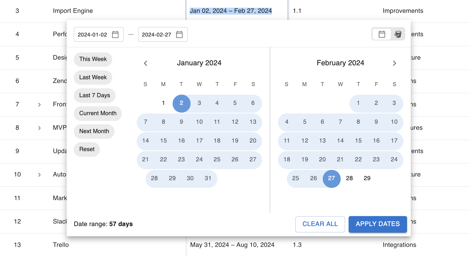
The Date Picker in the Table View allows users to interact with two fields in one place - the Date Field and the Bucket Field. While users cannot have both values present on the same item, they can toggle between them on an item-by-item basis and choose the value which best represents the time span or grouping for that particular roadmap item.
Field Headers
In your Table View, you can further contextualize your items using Fields. Each new field will appear as a new column on the table and they can be reordered to best fit the narrative you're trying to build with your roadmap data.
In the Table View, users can interact with the following Fields:
 | Item Name |  | Team Member Field |
A fixed field on the Table View, the Item Name displays the name of the roadmap item. Parent Items in the Table View will display a count of their Child Items, and Linked Items will display a count of all active links on that specific item. | Team Member Fields allow you to assign and inform your team of the items they own in your roadmap. The ability to automatically notify users of changes to assigned items and can be toggled on or off from the Field Card. | ||
 | Date Field |  | Single-Select List Field |
The date field allows users to input either Dates of Bucket values on their Items. Dates can either be typed or selected via our Date Picker, while Bucket values will appear in a dropdown list. | Single-Select List Fields allow users to apply a single value to their item from a pre-defined list of values. Once set, these values can be used to visualize their roadmap in their Swimlane and Timeline views. | ||
 | ID Field |  | Multi-Select List Field |
The ID field is a hidden read-only field which is displayed when an item is pulled from an integrated data source. This field can also be manually populated when items are assigned values in the External ID column of an uploaded CSV. | Multi-Select List Fields allow users to apply multiple values to their items and are visually distinct from their Single-Select counterpart, and can be further used to visualize their roadmaps in both the Swimlane and Timeline. | ||
 | Milestone Type Field |  | Standard Numeric Field |
When working in the Milestones Table View, users will be able to use the Milestone Type field to assign specific type values to the milestones on their roadmaps. This field determines how Milestones in the Timeline view are shown. | The Numeric Field allows users to input any positive or negative number (within the set threshold) and display up to 2 decimal places on the number provided, depending on the user's settings. | ||
 | Currency Field |  | Percentage Field |
The Currency Field allows users to display currency (up to two decimal places) in three formats in their Table View: Dollars, Pounds, and Euros. | The Percentage field is displayed as a filled bar on the Table View. Input on the Table is limited to any value between 0% and 100%; however, users can add values outside of this range from the Item Card. | ||
 | Freeform Text Field |  | Integrated Field |
The Freeform Text Field lets users manually input text into their roadmap, giving them an easy option to add short notes or important context to the item without having to add it to the item's description. | Certain fields are integrated with external tools and will display that tool's logo in the place of a field icon. For more information on setting up an integration, please visit our Integrating Toolssection. | ||
As of the September 2023 update, we no longer show different colored icons to indicate Account Level and Roadmap Level fields on the Table View. These details will instead be displayed when hovering over the column header, alongside the Field Name and Description. Fields are still sorted by type in the Add Field dropdown and visibility levels can be checked via the Field Card.
Actions Menu
When values are selected on the Table View, the Actions Menu will be revealed at the top of your table - a one-stop location for item management.
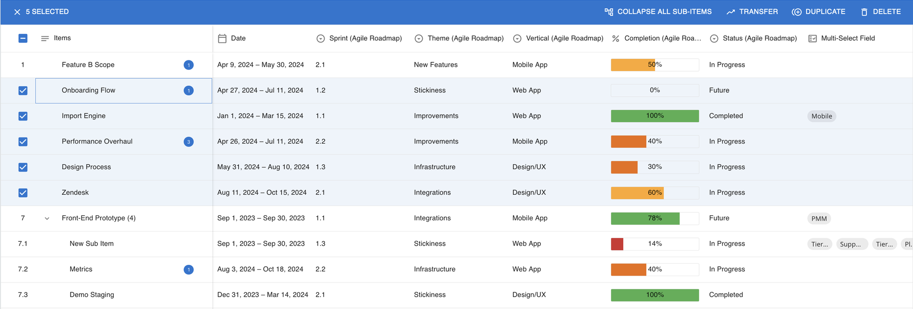
From this menu, users can complete the following actions on specific items in their Table View:
Duplicate Item(s): Users can duplicate the selected items on their roadmap.
Transfer Item(s): Users can transfer items from their current roadmap to another roadmap.
Delete Item(s): Users can delete the selected items from their roadmap.
Push/Sync Item(s): Users can push or sync their items to an integrated tool.
This menu also includes two new actions that allow users to quickly hide or reveal all sub-items:
Collapse All Sub-Items: Collapses all sub-item groups into their parent items.
Expand All Sub-Items: Expands all sub-item groups to show their child items.
Certain actions in the table view are limited to a set number of items in the view and will become unavailable if you exceed the maximum amount of items allowed for those actions. For more details on this, please check out our Maximum Number Of... section in our Roadmapping 103 article.
Context Menu
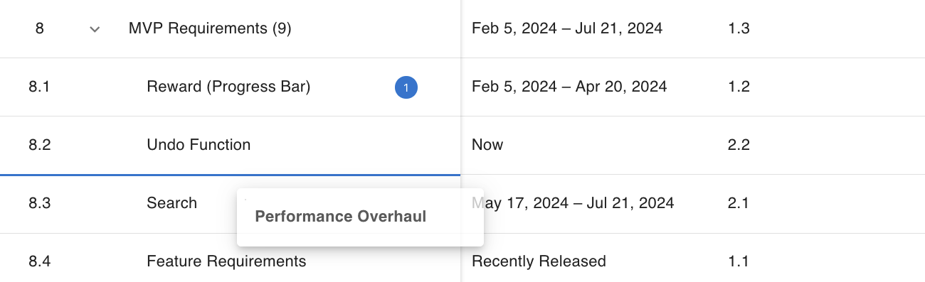
In the Table View, users can quickly access a selection of quick actions on their roadmap by opening the Context Menu. This menu is accessible by either clicking the three dots which appear on the right-side of every item's name when you hover over them or by right-clicking on an item. The context menu only applies to the item you're clicking on, so even if you have multiple items selected you will only be able to complete an action in the Context Menu for that specific item.
Keyboard Navigation
For a simpler navigation option, users can use their arrow keys and the Enter key to navigate and update the roadmap.
Indicators & Warnings in the Table View
In the Table View, users will notice a number of indicators and warnings as they're working with their data. These have been put in place to ensure that users are able to better understand the current state of their data or to simplify their workflows while managing their data.
Reordering Indicators
When reordering items in the Table View, users will notice that lines appear between the as the selected item(s) get(s) dragged and dropped. These lines can appear as either blue lines or red lines, with blue lines indicating a valid drop location for the item and red indicating an invalid drop location for that item.
Sub-Item Indicators
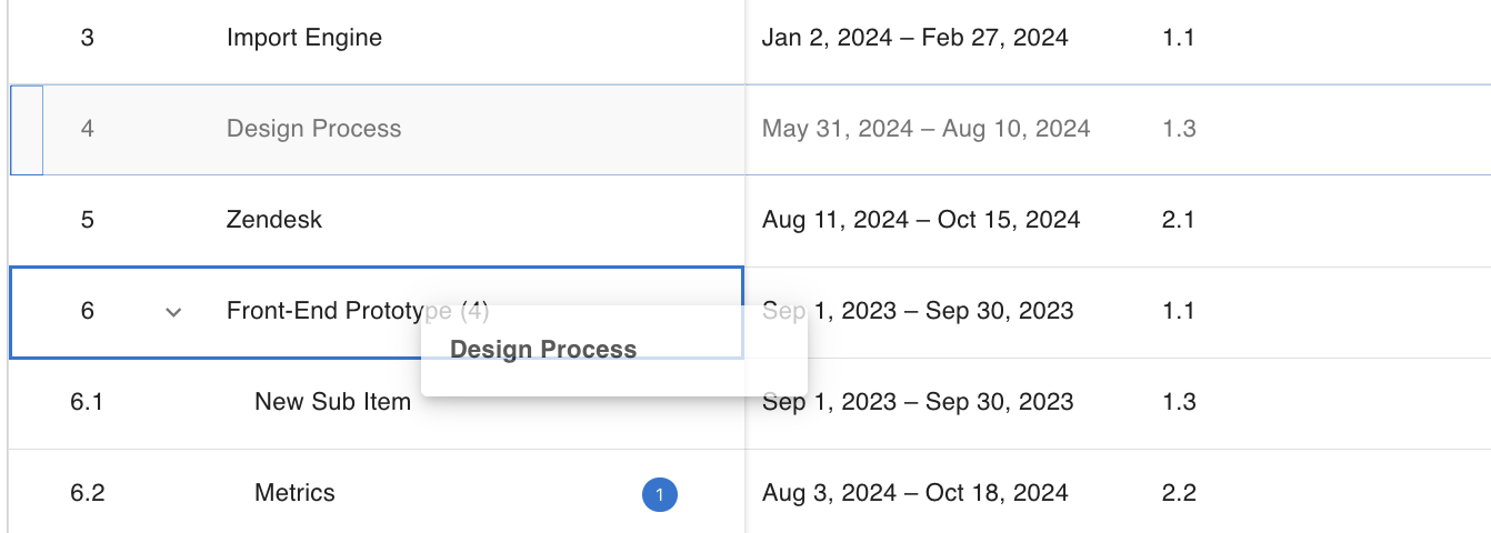
Users can create new sub-items from the Table View by dragging and dropping a standalone item on top of another item. When your item is dragged on top of another item, users will see either a blue box or red box, with a blue box indicating a valid parent item and red indicating an invalid parent item.
Additionally, any parent items shown in the Table View will now display an active count of the number of children they have attached to them. This count is shown in brackets beside the Item Name and is visible when the sub-items are both collapsed and expanded.
Item Link Indicator
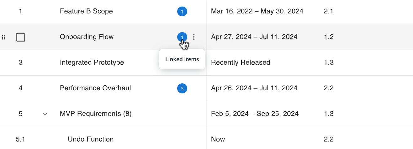
When a roadmap item in your Table View is linked to other items, whether that be within the same roadmap, cross-roadmap, or via an integration, a blue circular indicator in the Item Name column will display the total count of Linked Items. The indicator is updated automatically as the item is saved or synced.
Filters May Apply to Created Items Warning
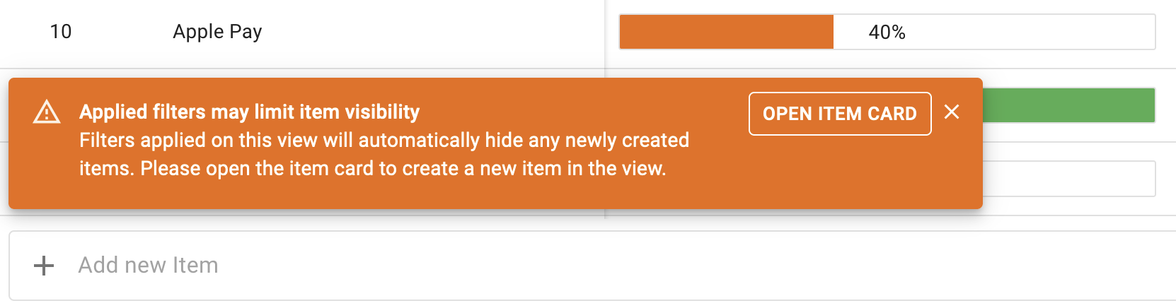
When creating an item in a roadmap view which has been filtered, the visibility of new items may be impacted. Strategic Roadmaps provides users with an immediate warning when attempting to create an item via a method where fields cannot be added, such as the Add New Item bar, and will prompt a user to navigate to the item card.
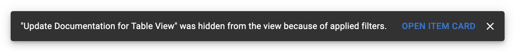
If a user disregards this message and creates an item in a filtered view, the item will be hidden and the user will be shown a message which prompts them to navigate to the recently created Item Card in order to apply the appropriate fields (if the user would like the item to be visible in Strategic Roadmaps).
Selection Exceeds Item Cap for Bulk Editing Warning
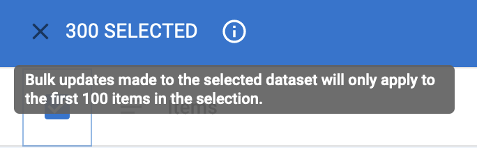
While users are able to select all items on the Table View, the application prevents them from being able to edit more than 100 items in a single action when Bulk Editing their items. We provide them with a warning tooltip in the Actions Menu prior to making these changes and a message shown after any changes made stating that only the first 100 items have been updated.
Integration Warnings & Errors
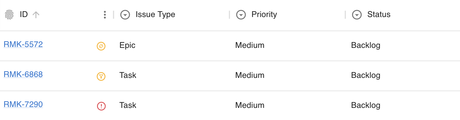
When integrating with other tools, Strategic Roadmaps provides users with up-to-the-minute insights into whether their items are being synchronized as expected. Strategic Roadmaps displays three different integration warnings in the ID field of the Table View:
Item Unlinked from Source: Displayed as an orange badge with a chain icon, this warning indicates that the item cannot be found in the source data set and may have been deleted or moved from your integrated project/board.
Item Doesn't Match Filters: Displayed as a yellow badge with a filter icon, this warning indicates that the item was previously synchronized when it met the filter criteria, but no longer meets that criteria.
Item Cannot Be Synced: Displayed as a red badge with an exclamation mark icon, this standard warning indicates that there was an issue synchronizing this particular item with the integration source and that it may require review.