Viewing plans for other team members requires the View team plans permission.
This page applies to Tempo Capacity Planner version 7.8 or later.
You can customize your reports so that they show what you need in a meaningful manner. By default, report results are displayed in a grid format but you can also view the data as a detailed list. You can apply filters, organize the information into groups, sort the data by columns, set report preferences, and add columns to show Jira fields and work attributes as needed. When viewing reports as a grid, you can also define whether the grids represent days, weeks, months, or quarters.
Tempo remembers all your view settings and preferences between sessions.
To access reports:
-
Select Reports :reports_dc: in the Tempo sidebar.
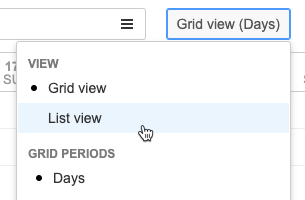
Switching Between Grid and List View
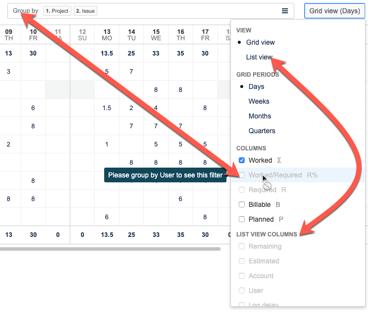
To switch between grid and list view, click the View button at the top-right, and then select either Grid view or List view.
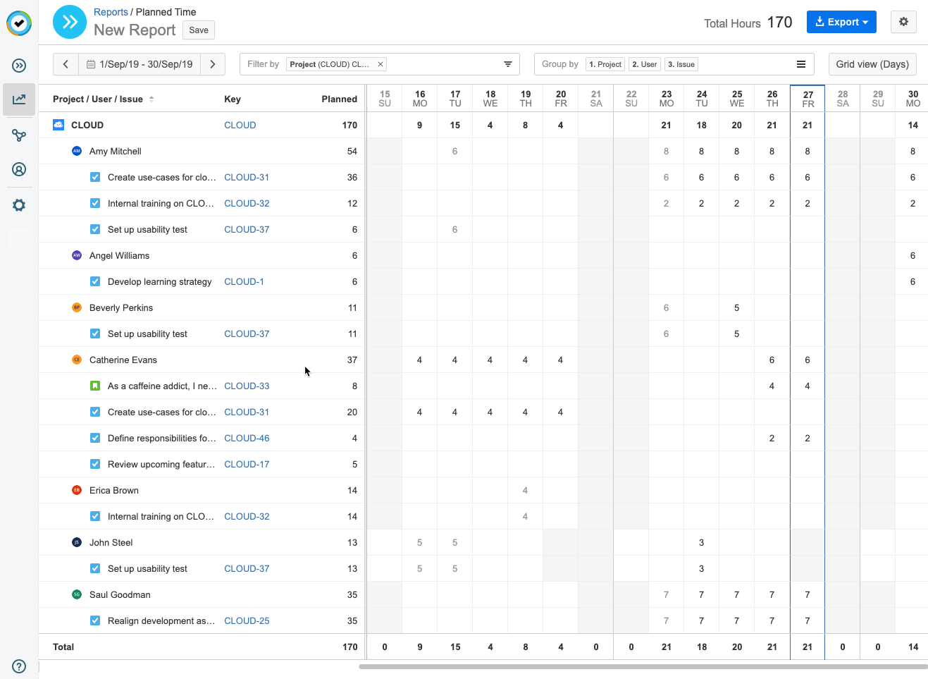
Report Grid
The grid view displays the report information in a timesheet format. Each column in the grid represents a day, week, month, or quarter, depending on the Grid Periods option you select on the Grid view drop-down menu.
-
By default, the grids represent days. You can select a different grid period and use the date picker to select a period to see what you need. Click Grid view at the top-right to select a grid period.
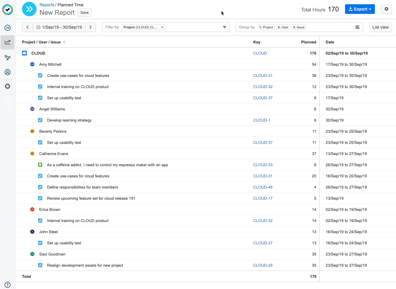
List View
You can select to display the report as a detailed list. The list view shows you the report information in table format. You can choose which which attributes or work attributes to show using the Columns and List View Columns options on the List view drop-down menu.
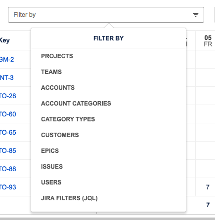
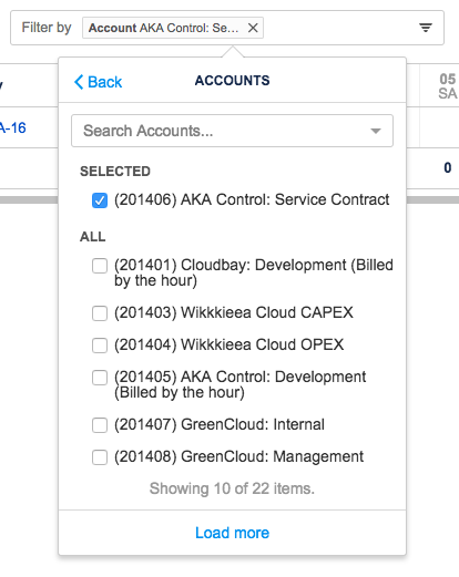
Filtering Data
Select filters for the reports to show only the information you need. You can, for example, select to view time planned on a specific project or all planned work for your team. The Filter by box at the top of the report shows which filters are applied.
To filter data in a report:
-
Click the Filter by box to display a list of filter options.
-
Select the data you want to include in the report.
-
Use the search box to search for projects, teams, accounts, etc. To add a filter, select its checkbox. To remove a filter, clear the check-box or click the x beside its name in the Filter by box.
-
If you select to filter by issues, you can also choose to include sub-tasks.
-
Click Back to return to the list of filters.
-
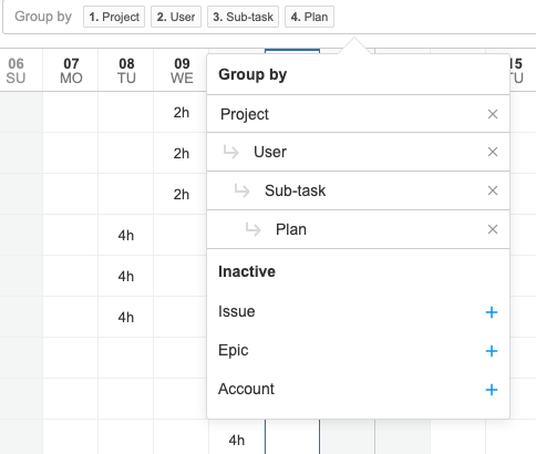
Grouping Data
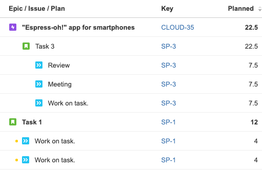
Group data in your reports to help you structure your information in a meaningful way. The groups are displayed in the report according to Jira hierarchy.
To simplify the report view, reports containing multiple levels of grouping do not display "empty" hierarchy levels. The following example shows a report that has been grouped by Epic/Issue/Plan. No Epic hierarchy level is shown for Issue Task 1 since it is not linked to an epic. This makes the report look tidier and more easy to read.
To group data in a report:
-
Click the Group by box to display a list of possible choices. Select the groups you want to add.
-
To remove a level of grouping, click Group by, and then click x to the right of the specified group level.
Tip
Plans submitted for approval are labelled with a colored dot to indicate their approval status. A green dot means that they have been approved, yellow that they are in review, and red indicates a rejected plan. You can hover the mouse pointer over the dot to get approval details
Sorting Data
One way of organizing your report is to sort the data in alphabetical or numerical order. Sort a report by the data in a particular column by clicking that column’s heading. Clicking a column header sorts data according to that column’s ascending or descending order: text is sorted from A to Z, numerical data is sorted from highest to lowest, and time/date data is sorted from earliest to latest.
-
Up and down arrows next to a column name indicate that data is being sorted by that column.
-
To reverse the sort order, click the column heading a second time.
-
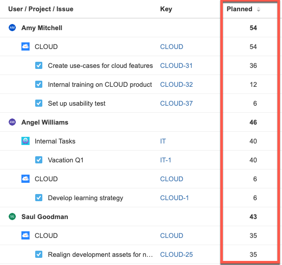
In a report with multiple grouping levels, data is grouped by the top-level group. For example, the report above shows the most number of planned hours at the top sorted by user.
Adding and Removing Columns
When grouping the report by user, you can add columns that show hours required per user and how big a portion of those required hours has been planned.
You can also display more columns of data in List view where results are grouped by plan. This data includes, for example, plan status, reviewer, etc.
To add columns:
-
Click the Grid view or List view button at the far right. The button's label depends on which view is displayed.
-
Select the columns you want to show in your report.
-
To remove a column from the view, clear the checkbox next to its name on the Grid/List view menu.
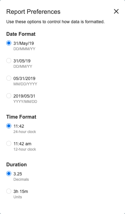
Setting Date and Time Formats
You can select how dates, times, and duration are shown in your reports. Your preferences are applied immediately and are saved on a per-user basis. This affects how the date is displayed in the Date and Created columns in the List view when grouping by worklog, and in the Report Title field when saving.
To change the date, time, and duration format:
-
Click the Settings button

-
Select options as desired.
Related Topics