This feature is only available to Collaborators, User Managers, and Account Administrators.
Swimlanes allow you to organize items on a dynamic grid, enabling both horizontal and vertical pivots to customize the visualization based on context-relevant fields. This approach is great for both planning and presenting your roadmaps, while making it easy to adapt plans as priorities shift and helping teams respond to change without losing high-level alignment.
The other type of roadmap visualization in Strategic Roadmaps is a Timeline, which provides a more time-oriented visualization (see our overview on Timeline views).
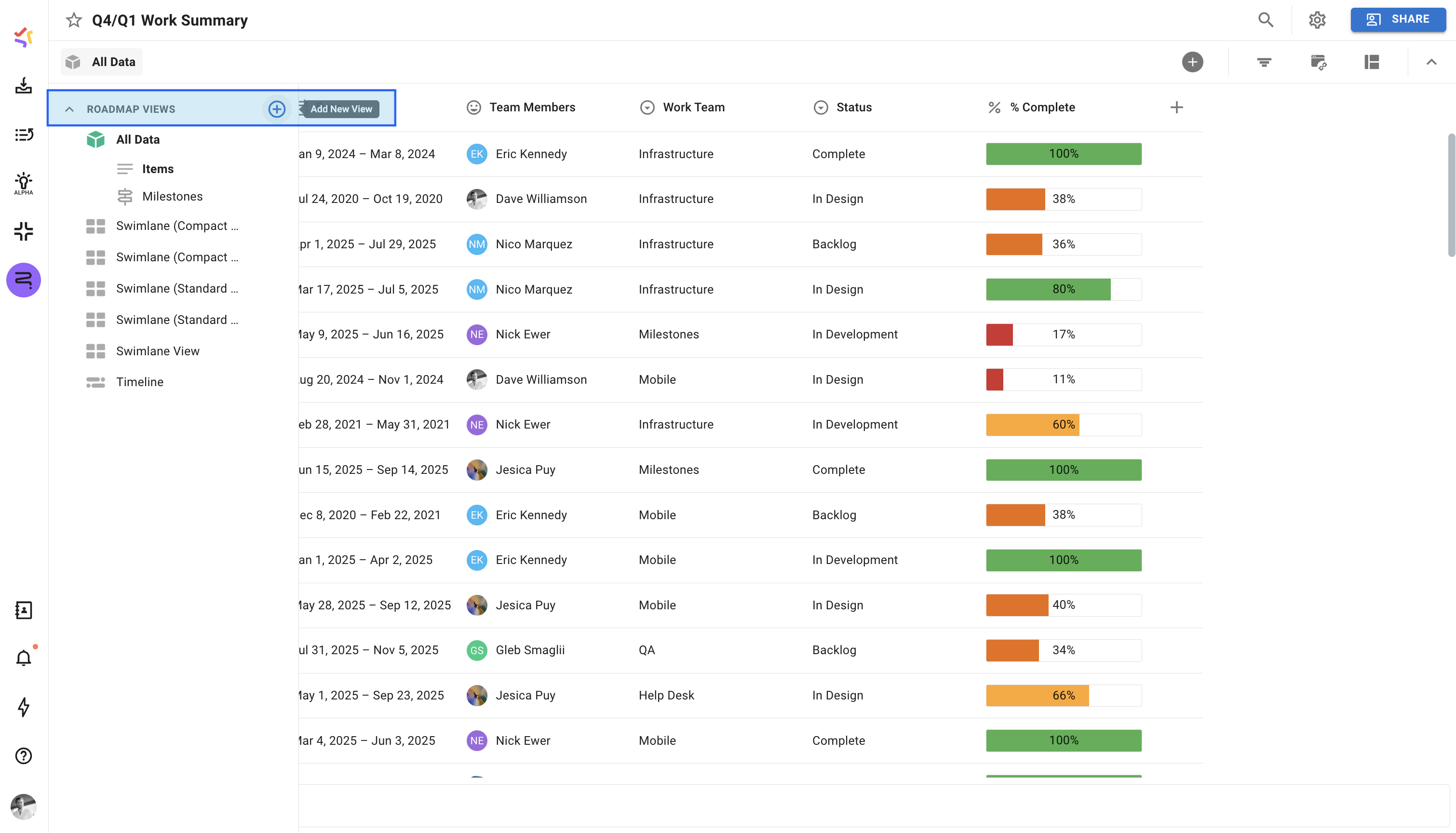
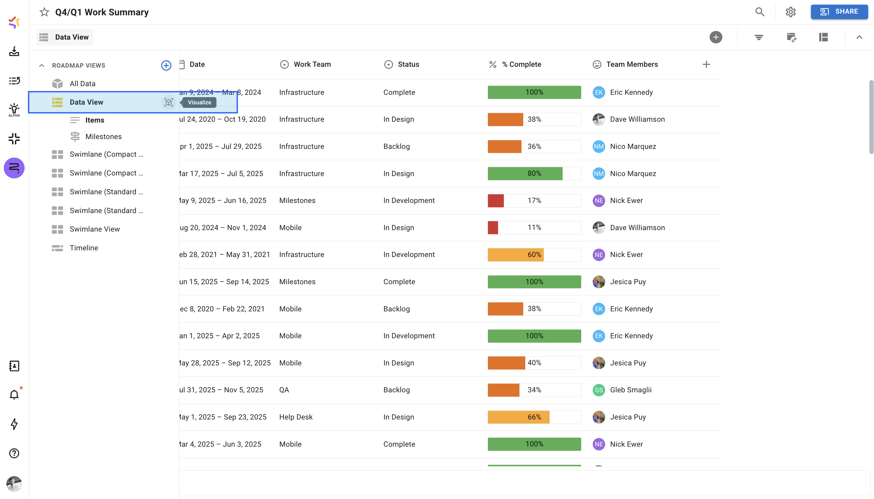
Adding a Swimlane View
To set up a new Swimlane on your roadmap, start by creating a new roadmap view, applying filters to include specific items, and customizing the layout and colors.
Once created, your Swimlane will display only the items that meet your chosen filter criteria. You can confirm which filters you have set up by clicking the Filter icon in the road mapping toolbar.
Note: Milestones are only visible in Timeline views and won’t appear in the Swimlane.
First Steps in the Swimlane
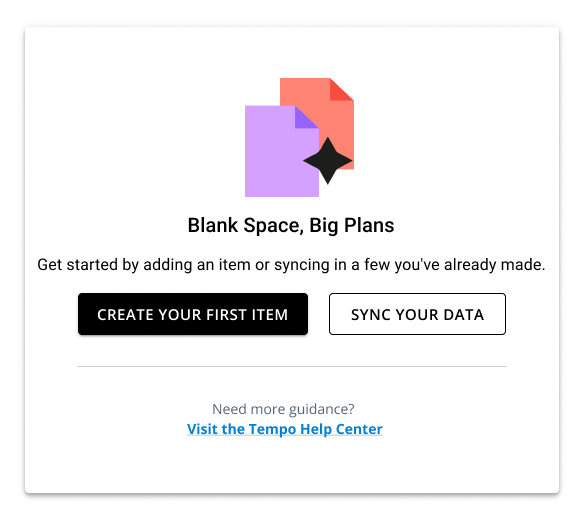
If you haven’t created any items on your roadmap yet, you’ll likely see the empty state helper for Swimlane views. From this helper, you’re provided with three options:
-
Create Your First Item: Opens the Item Card in the Create State.
-
Sync Your Data: Opens the Integrations Panel in the view.
-
Visit the Tempo Help Center: Opens the article you’re currently viewing.
Navigating the Swimlane
Exploring the Swimlane Visualization
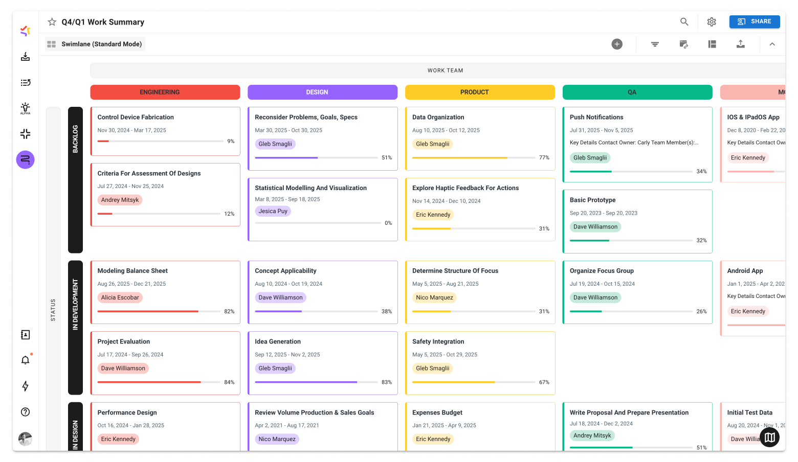
The Swimlane can be customized to fit your needs, showing as much or as little data as necessary. Key areas in the visualization include:
-
Roadmapping Toolbar: Located at the top of the page, this collapsible toolbar allows users to quickly access key tools like their Filters, Integration, and Formatting Settings, and their Publishing Options.
-
Axis Labels: Axis labels provide users with a quick glimpse of the field(s) they’re currently using as column and/or row headers in their roadmap and can be clicked into to change or remove the fields used on the roadmap.
-
Column Headers: All Swimlane visualizations have column headers by default, and these headers cannot be removed. Column Headers are presented at the top of the screen.
-
Row Headers: Similar to the Column Headers, users have the option to further break down their data by configuring Row Headers and Row Groups. These are shown on the right side of the roadmap.
-
Items: Items are plotted in the Swimlane in alignment with the Column and Row Headers. They can be displayed in both Compact and Standard modes, depending on the amount of data required.
-
Legend: Located in the bottom-left corner, the Legend can appear when a user is working with custom and default color palettes. This tool does not appear when using the Base Color Palette.
Exploring the Standard Swimlane Cards
.png?cb=8ac1e1dde98912072c87d6acbfb7ae85)
The Standard Mode of the Swimlane Card shows all available data on the Swimlane:
-
Item Name: The Item Name section acts as the card's title. Users can set the visible number of lines of the title from the Format Panel, with the single-line option (Show Less) offering a marquee on hover to improve the readability of longer titles.
-
Date/Bucket: The Date/Bucket section of the card displays either the item's date/date range or the Bucket value associated with it.
-
Description: The Description section shows a short preview of your roadmap item’s Description field. The description is displayed by default as a single line and can be expanded to three lines on hover.
-
Labels: Users can set any type of field as the Label on their roadmap items. In the case of Multi-Select or Team Member fields, multiple label chips are shown on the card.
-
Item Progress: If a roadmap item has a percentage field associated with it, it can be set to appear as the Item Progress. This field is automatically updated as the field value is changed elsewhere.
-
Item Details: A collection of small chips on the bottom of the card that shows the counts of important collaboration features. See Exploring the Item Details below for more details.
-
Sub-Items: Displays a count of all sub-items associated with the card and can be clicked into to show all sub-items. If none exist, the field displays a plus icon and allows users to add a sub-item.
-
Context Menu: Available by clicking the ellipsis menu in the top right, this menu provides a selection of additional item controls. See Exploring the Context Menu below for more details.
Exploring the Compact Swimlane Cards
.png?cb=b60809f32656b8dd8e3f8cb197f75999)
The Compact Mode of the Swimlane Card shows a limited selection of data on the Swimlane:
-
Item Name: The Item Name section acts as the card's title. Users can set the visible number of lines of the title from the Format Panel, with the single-line option (Show Less) offering a marquee on hover to improve readability of longer titles.
-
Date/Bucket: The Date/Bucket section of the card displays either the item's date/date range or the Bucket value associated with it.
-
Description: The Description section shows a short preview of your roadmap item’s Description field. The description is displayed by default as a single line and can be expanded to three lines on hover.
-
Item Progress: If a roadmap item has a percentage field associated with it, it can be set to appear as the Item Progress. This field is automatically updated as the field value is changed elsewhere.
-
Sub-Items: Displays a count of all sub-items associated with the card and can be clicked into to show all sub-items. If none exist, the field displays a plus icon and allows users to add a sub-item.
-
Context Menu: Available by clicking the ellipsis menu in the top right, this menu provides a selection of additional item controls.
Exploring the Item Details
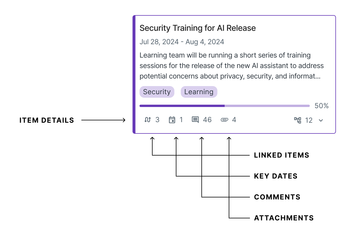
The Item Details section displays counts of commonly-used collaboration features - allowing users to get an at-a-glance look into the additional details of the item that are not often present in the visualization layer. The available counts for the Item Details section include:
-
Linked Items: Displays the total number of in-roadmap and cross-roadmap item links.
-
Key Dates: Displays the number of key dates associated with this item.
-
Comments: Displays the total number of comments made on the item.
-
Attachments: Displays the active number of file attachments on the item card.
Similar to the Linked Items Indicator in the Table View, users can quickly access any of these sections on their item card by clicking the provided chips.
Exploring the Context Menu
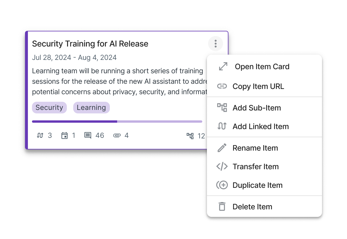
In the Swimlane View, users can quickly access a selection of quick actions on their roadmap by opening the Context Menu. This menu is accessible by clicking the three dots that appear on the top right of the Swimlane Card when you hover over them or by right-clicking on an item. The context menu only applies to the item you're clicking on, so even if you have multiple items selected you will only be able to complete an action in the Context Menu for that specific item.
From this menu, users are able to complete the following actions:
-
Open Item Card: Opens the full item card for the selected roadmap item.
-
Copy Item URL: Copies a direct link to the item to your clipboard.
-
Add Sub-Item: Opens the Sub-Items tab to create a new sub-item.
-
Add Linked Item: Opens the Linked Items tab to create a new link.
-
Rename Item: Opens the Item Card and targets the Item Name field at the top for editing.
-
Transfer Item: Allows you to transfer an item from the current roadmap to another roadmap.
-
Duplicate Item: Allows you to create a clone of the selected item in the roadmap.
-
Delete Item: Deletes the selected item from the roadmap. This action cannot be undone.
Configuring the Column Header
The column header serves as the Swimlane's horizontal pivot. Unlike Timelines, which have time as a fixed horizontal pivot, Swimlanes allow you to customize the horizontal pivot by selecting the field you want to use for the column header.
Change the Swimlane Header
To change the column headers:
-
On the View navbar, click the Format icon.
-
In the Layout tab, click the Column Header dropdown.
-
In the dropdown, select Change Column Header.
-
You can choose to use an existing field, use item dates, use parent items, or create a new field for the header.

Show More
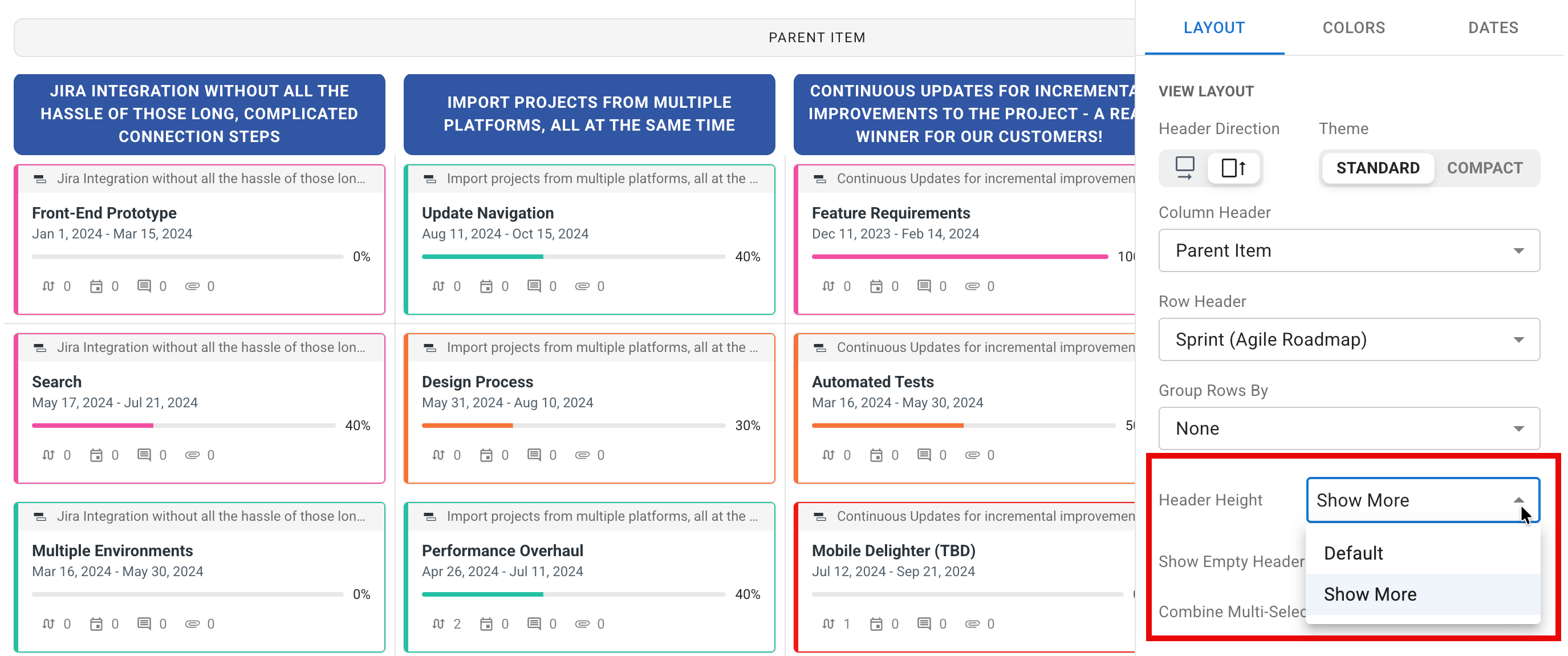
If you need to visualize more information in your column headers, you can increase their size:
-
In the Layout tab, open the Header Height dropdown and select Show More.
Configuring the Row Header
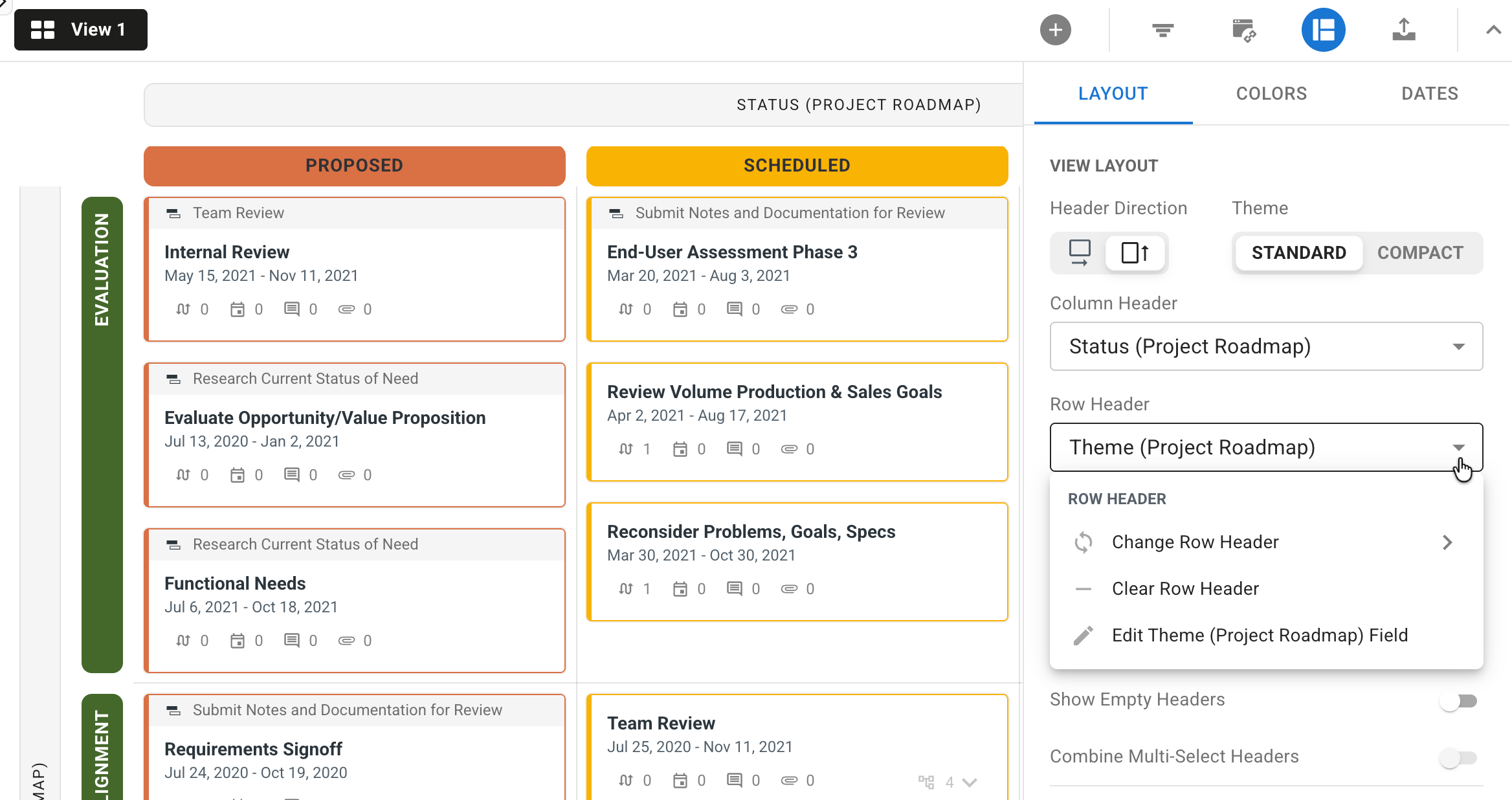
The row header serves as the Swimlane's vertical pivot. Unlike Timelines, Swimlanes have a single vertical header. Like the column header, you can select any field in the roadmap for the row header.
Add the Row Header
-
Still in the Layout tab, click the Row Header dropdown.
-
In the dropdown, select the field you want to use for the vertical pivot.
Create Row Groups
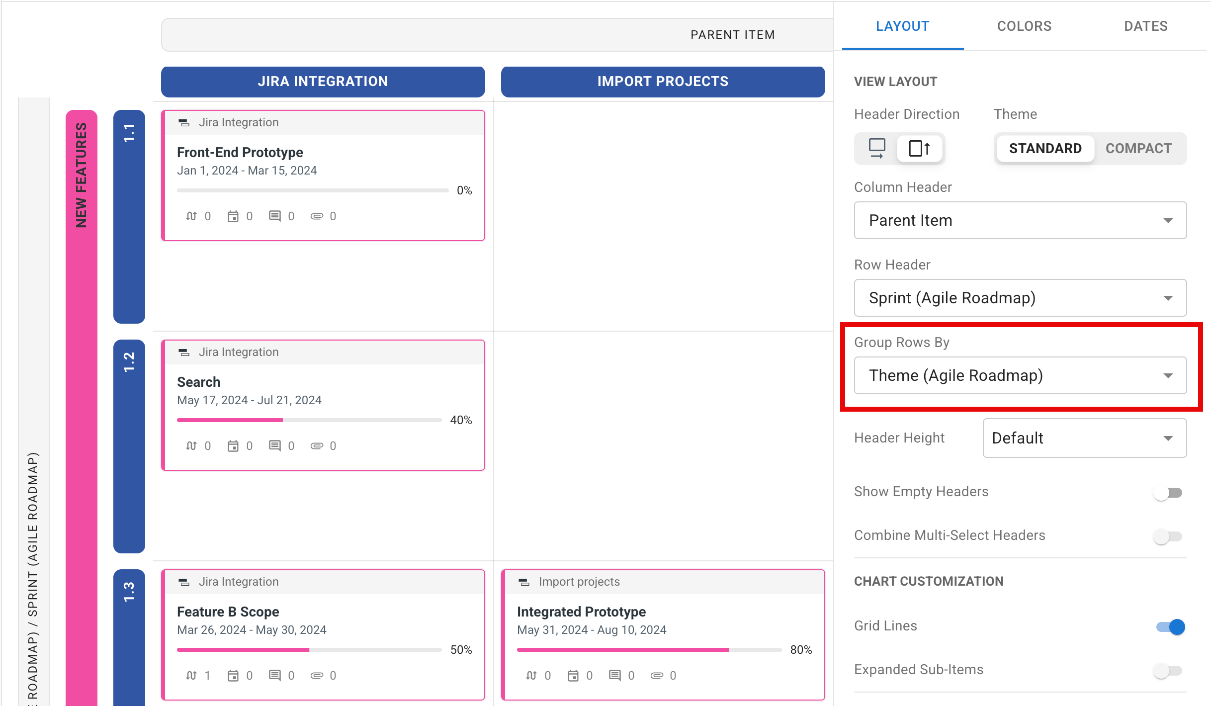
It is also possible to add a second layer of Row headers, grouping your existing headers by any List, Multi-Select, or Team Member field:
-
In the Layout tab, click the Group Rows By dropdown.
-
In the dropdown, select a List, Multi-Select, or Team Member field.
Adding Items through the Empty State Helper

If you haven’t created any items on your roadmap yet, the first time you open the swimlane view, you’ll likely see the empty state helper. From this helper, you’re provided with three options (two of which allow you to create/add items to your roadmap):
-
Create Your First Item: Opens the Item Card in the Create State.
-
Sync Your Data: Opens the Integrations Panel in the view.
-
Visit the Tempo Help Center: Opens the article you’re currently viewing.
Once the first item has been created or synced with the roadmap, the empty state helper will no longer be visible and will remain hidden unless all items are removed from the roadmap.
Adding Items Through the In-Line Add Item Triggers
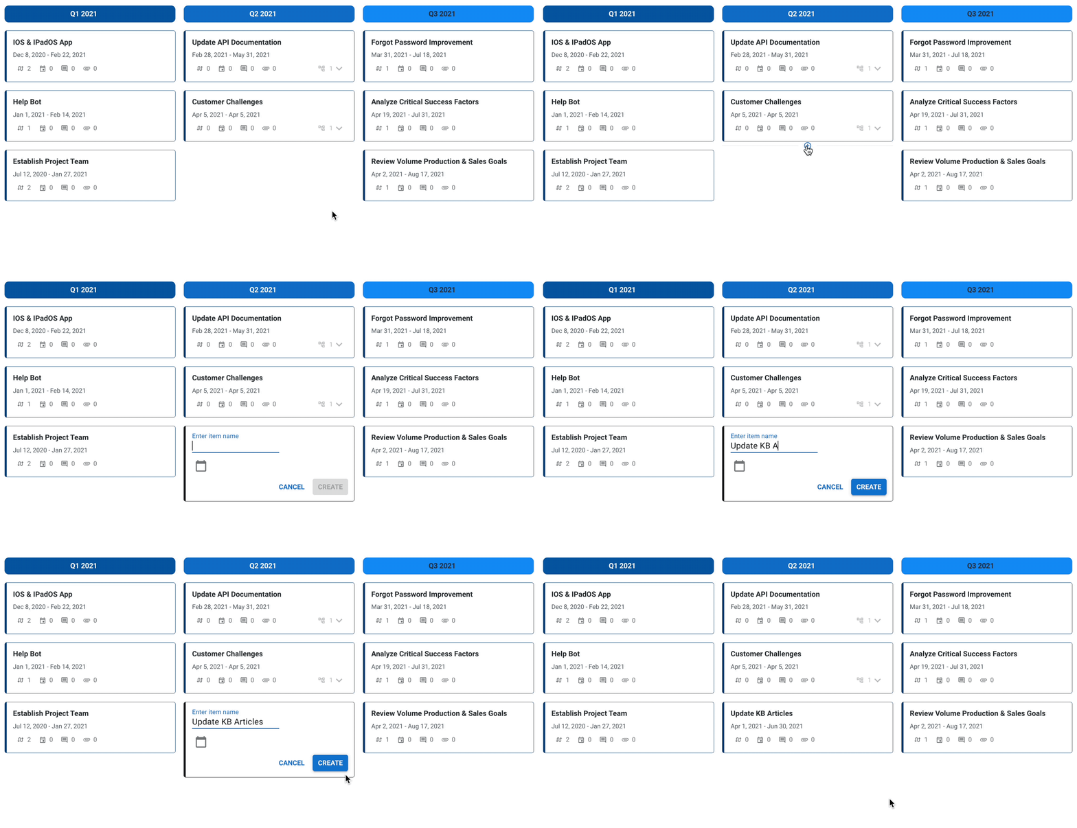
To create a new item in the Swimlane using the In-Line Add New Item option, simply hover your mouse between or below existing items on the roadmap. A thin plus indicator will appear and, when clicked, will open a small card to create a new item.
Similar to legacy, dates are automatically applied for the respective time range an item is created under if the Row or Column Header is set to use dates. If you need to add more fields or additional details, you can click the expand button in the top-right corner at any time to access the full Create New Item card.
Note: While you can create new items anywhere on the roadmap, certain filter conditions may prevent them from being visible after being created. If a newly created item is not appearing where it should, you can easily review your filter settings in the Filters panel.
Adding Items Through the Quick Actions Menu
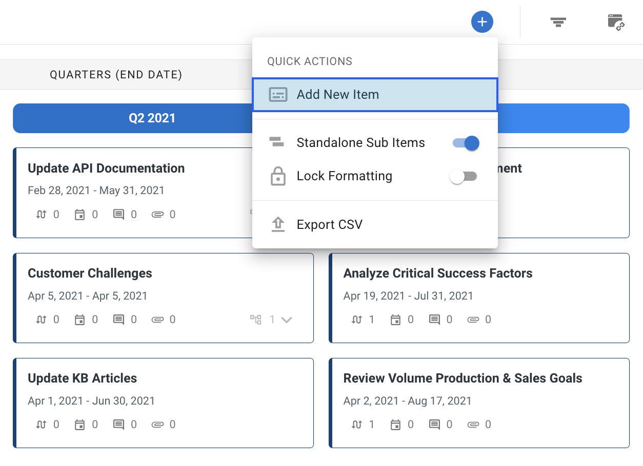
Similar to the Table View, Swimlane users can create new items using the Add New Item option in the Quick Actions menu. When clicked, the Add New Item option will open a blank item card and provide users with the option to fill in all fields and details for the item. Once saved, a respective Swimlane Card will be generated in the visualization.
Note: As with the in-line creation method, certain filter conditions may prevent them from being visible after being created. Please review your current filter settings prior to creating new items in order to determine any required fields or dates.
Adding Items through the Filter Warning
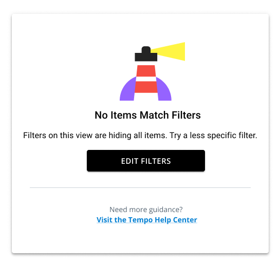
On occasion, certain filter combinations can prevent all items from being shown on the roadmap. In this case, users are shown the filter warning in the center of the roadmap view. This warning provides users with two options:
-
Edit Filters: Opens the Filters Panel for the roadmap view.
-
Visit the Tempo Help Center: Opens a short guide on working with filters in roadmaps.
