This feature is only available to Collaborators, User Managers, and Account Administrators.
Terms to Know
-
Sub-Panel - Effectively, a panel within a panel. In the Item Card, we have two sub-panels for both the contextual information and granular details of your items. (Context and Details Sub-Panels, respectively).
-
WYSIWYG - Literally stands for "What You See Is What You Get", typically applying to editors or controls in an interface (in this case, our text editor in Description Fields).
When building and navigating through your roadmaps, all items that you create will have an associated Item Card which houses all of that item's data - including any assigned field values, attached files, and a helpful activity log. To access the Item Card, simply click into the name of any item from the Items Table view or click into an item on your roadmap from your Swimlane or Timeline view.
Navigating the Item Card
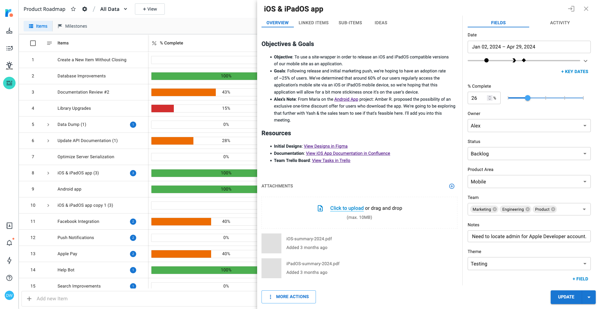
Visually, the Item Card is split into two main sections: the Context Sub-Panel and the Details Sub-Panel. These two sub-panels work in tandem to allow users to better explore the card and present multiple pieces of item data simultaneously.
In the main section of the Item Card on the left-hand side, the Context Sub-Panel, there are four tabs which are always visible that contain the more high-level contextual details of the item you're viewing:
-
Overview Tab: This tab houses all of the contextual details of the item card, including your Item Description and File Attachments.
-
Linked Items Tab: In this tab, you can quickly view and update In-Roadmap, Cross-Roadmap and Integrated Item Links.
-
Sub-Items Tab: This tab allows you to create, manage, and update the Parent and Child relationships between both your existing items and newly created items.
-
Ideas Tab: From this tab, you can quickly view and navigate all of the Ideas that have been connected to your roadmap items.
In the collapsible section of the card on the right-hand side, the Details Sub-Panel, there are two tabs which focus more on the granular details of your card:
-
Fields Tab: This tab allows you to quickly add, update, and view any assigned Dates, Buckets, or Key Dates, along with the Assigned Field Values for your item.
-
Activity Tab: This tab gives you a complete rundown of all updates that have been made to your item and lets you seamlessly collaborate using Comments.
Additionally, the card houses several additional buttons with a number of controls:
-
More Actions Button:
-
Copy Item URL: Generates a link to the item in your clipboard.
-
Duplicate Item: Allows a user to create a carbon copy of the existing item.
-
Delete Item: Allows a user to delete the item they're viewing.
-
-
Integration Button:
-
Sync Now: Triggers a sync for an item via the roadmap's active integration.
-
-
Create/Update Button:
-
Create/Update Button: Saves the item you're working on and closes the Item Card.
-
Save/Update Without Closing: Saves the item you're viewing without closing the Item Card.
-
Save & Create Another: Saves the item you're working on and creates another with the same settings.
-
Adding a Description to your Item Card
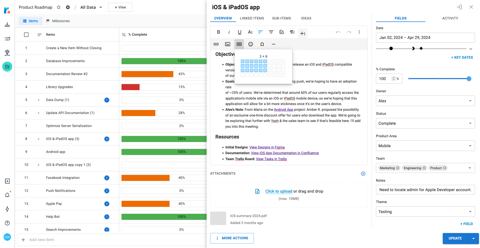
Considering that the Item Card can be viewed by both internal users from the building environment and external users in the published environment, the Description Field is an extremely valuable place to store additional context on an item and provide your end-users and teammates with more insight into the decisions and direction being made around this item.
In Strategic Roadmaps, we use a WYSIWYG editor to simplify the setup process. In this editor, users are able to navigate the toolbar to generate rich text elements in their Description Field.
Alternatively, they can use one of the following key commands to update the content of the description:
|
Common actions |
|
|
Copy |
CTRL+C | ⌘C |
|
Cut |
CTRL+X | ⌘X |
|
Paste |
CTRL+V | ⌘V |
|
Undo |
CTRL+Z | ⌘Z |
|
Redo |
CTRL+Shift+Z | ⌘Shift+Z |
|
Insert Link |
CTRL+K | ⌘K |
|
Insert Image |
CTRL+P | ⌘P |
|
Basic Formatting |
|
|
Select All |
CTRL+A | ⌘A |
|
Bold |
CTRL+B | ⌘B |
|
Italic |
CTRL+I | ⌘I |
|
Underline |
CTRL+U | ⌘U |
|
Strikethrough |
CTRL+S | ⌘S |
|
Increase Indent |
CTRL+] | ⌘] |
|
Decrease Indent |
CTRL+[ | ⌘[ |
|
Quote |
|
|
Increase quote level |
CTRL+' | ⌘' |
|
Decrease quote level |
CTRL+Shift+' | ⌘Shift+' |
|
Image / Video |
|
|
Resize larger |
CTRL++ | ⌘+ |
|
Resize smaller |
CTRL+- | ⌘- |
|
Table |
|
|
Select table cell |
Alt+Space |
|
Extend selection one cell |
Shift+Left/Right arrow |
|
Extend selection one row |
Shift+Up/Down arrow |
|
Navigation |
|
|
Shortcuts |
CTRL+/ | ⌘/ |
|
Focus popup / toolbar |
Alt+F10 |
|
Return focus to previous position |
Esc |
Managing & Ordering Fields on your Item Card
Adding & Defining Field Values to the Item Card
Fields that are added to your Items Table view are automatically visible on the Item Card, and new fields can be added from the Item Card at any time by clicking into the + Field button at the bottom of the Fields Tab. Once the fields are added, users with edit permissions for the roadmap are able to adjust the current date span of an item and apply user-specified field values to their items through the field drop-downs listed in the Fields Tab.
Ordering & Reordering Fields on Item Card
The fields on your item card are ordered based on the field order in you All Data view of your roadmap; however, users with edit permissions on the roadmap can easily adjust this order in your cards by clicking onto the draggable element on the left hand side of the field and moving the field to the correct space. All fields, with the exception of the Date field, can be reordered as needed and the order will be retained once the card has been updated.
The changes are roadmap-specific, not card-specific - this means that the changes made in this card are reflected on all other cards in the roadmap. Additionally, the field order is maintained in any visualization which is pulling this data as a source - this means that both published roadmap views and Portfolio Roadmap views will retain this order for items from this specific roadmap.
FAQ's
-
What from the item card is visible on a published roadmap? All values in the context sub-panel, with the exception of the Attachments section, are visible in the published roadmap view. While the Fields Tab is visible on published roadmaps, the Activity Tab and any internal-user comments are not.
-
Can I reorder fields for multiple source roadmaps from a Portfolio roadmap? No - not at this time. Field order is roadmap-specific, which means that the fields on the item card will appear in their source roadmap-specified order in the Portfolio Roadmap view.
-
Are there any limits to the length of the description or the number of attached files? Yes - Item Card Descriptions have a limit of 10000 characters, inclusive of Markdown formatting, while the Attachment Limit 10MB per file, with an upward storage limit defined by your plan (1GB - 100GB)
-
Why is a field greyed out? If the field in question was created in Strategic Roadmaps, this would usually mean that you don't have the appropriate permissions to make changes on this roadmap. If the field was created through the Jira Integration, this would typically mean that the field is marked as read-only by either your project's field settings in Jira or by Atlassian's API.